Annotated 16-17
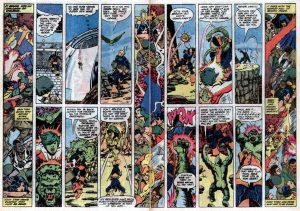
 When I got all the way into superhero comics, I imprinted heavily on the art style of George Perez, whom I’ve already mentioned here a time or two. His oeuvre is probably still my favorite overall (so much loving detail!). What sets his page designs apart is not difficult to grasp: while a lot of superhero artists from his time and since (John Byrne, Jim Lee, Bryan Hitch) have gone for bigger and splashier illustrations in their fight scenes (and usually throughout their stories), Perez keeps it frantic but pumps up the average panel count, with only a few splash pages or splash panels every now and then. (He’s basically retired at this point, but contributed a page to Marvel Comics #1000 a week or two ago.)
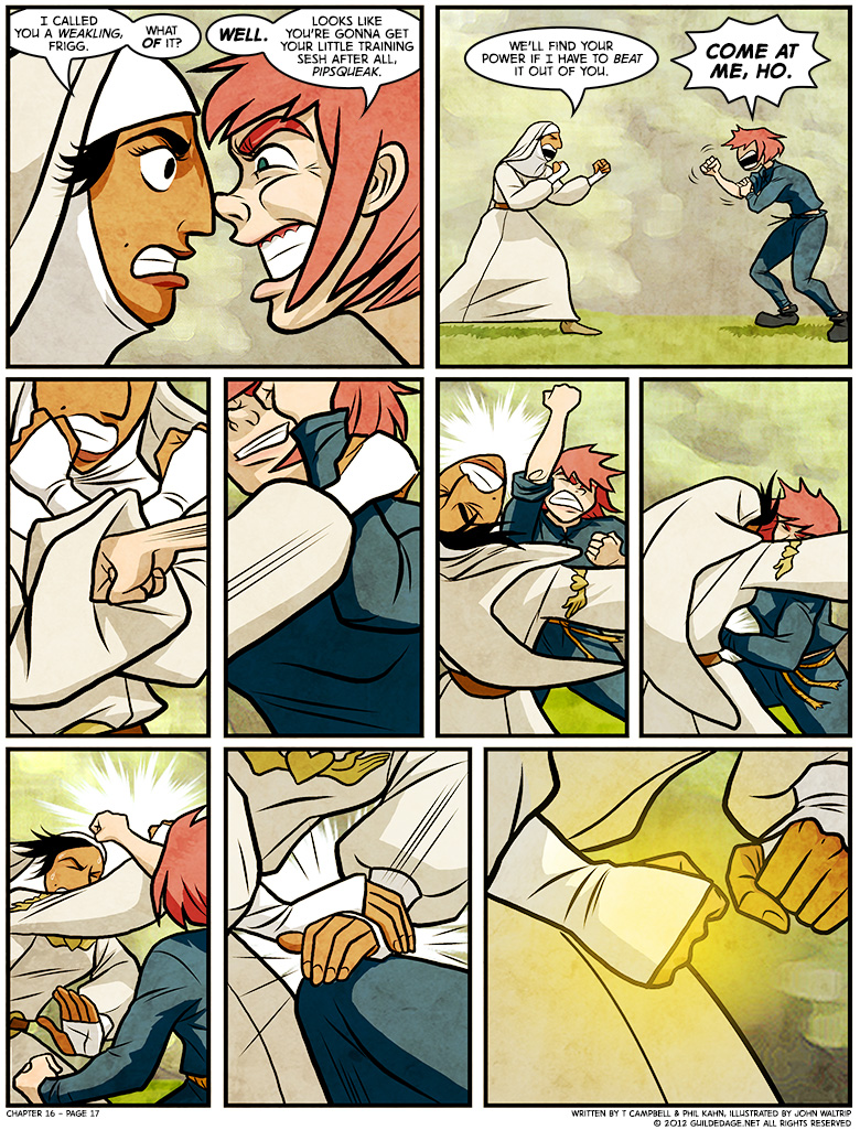
I’d be pretty crazy to expect anyone else to do like Perez does on a regular basis. Artists deliver their best work when they can bring in their own philosophies, and even though John prefers direction, he clearly enjoys some latitude when making certain decisions. That’s why even this page isn’t really that Perezian.
But every once in a while, nine panels of unequal size is clearly the way to go.


Please excuse me while I get huge nostalgia feels of my favorite hero during my teenage years holding his own against Deathstroke, drawn by my favorite comics artist. @_@
Yeah, back in the day, Perez on the Titans was one I looked forward to every month.
U mad, ho?