Annotated Chapter 6 Cover
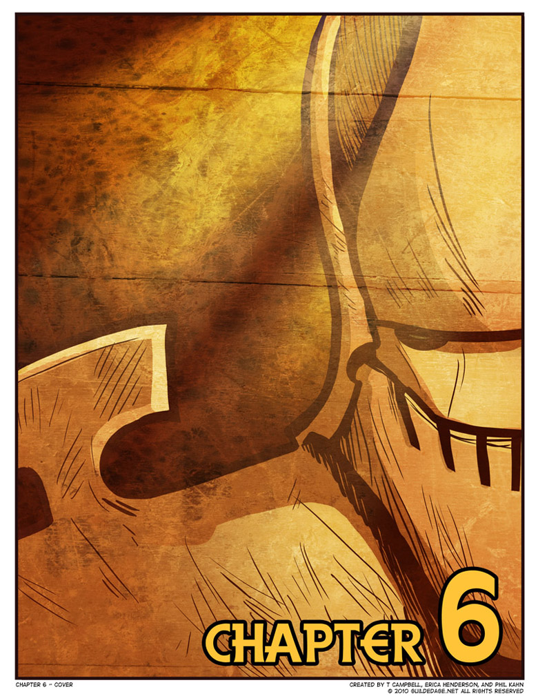
 There’s no real backstory to this one. It was the first idea I came up with, Phil liked it fine as it was, Erica drew it with no tweaks.
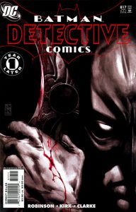
I’m a little surprised that this kind of “half-full-face” composition isn’t more popular in comics covers or design in general. The Detective Comics cover seen here is the only one I could find offhand that sort of matches it, and it’s part of a Two-Face-themed pair of variants, so it barely counts. I know George Perez used to use this sort of split face in a lot of panels in his early work, but never covers.
This cover seems to defy the convention we’d been establishing since Chapter 2 of not showing any “characters” on the cover per se, only body parts and/or inanimate objects. Here’s Gigundus, looking right at us. But even if you don’t know why this isn’t actually breaking that rule, the fact that nothing can be seen beneath that helm gives him the forbidding remoteness I was hoping for.


I didn’t really notice this convention until you mentioned it, but now i know it’s obvious.
I really want to make a FMA reference, but its been so long since I’ve seen it, I can’t think of any appropriate lines…
Oh is that what it is? I didn’t recognize him from this side…