


Annotated 9-10
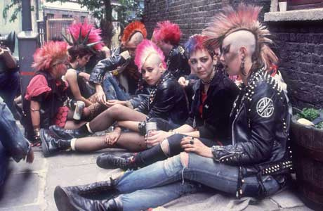 One of Phil’s best visual ideas, certainly the best we used in this chapter, was that Best would periodically update his look to suit different phases of his life, much as musical artists rebrand themselves. Early notes described this as his “David Bowie 1980s period,” but at some point I think we moved to a more general punk-rock vibe without getting Bowie-specific (except the hair, maybe).
But I loved the design John sent in. I’m particularly taken with the logo on Best’s back jacket, a stylized “pb” that plays off the way those lower-case letters sort of mirror each other and their resemblance to reversed musical notes.
The dialogue of the land sharks was not something Phil added to this scene until it was time to start lettering. I approved a version of the page where they were silent stalkers, but boy, is this an improvement.


Kiernas or Keirnas? Best and the tags don’t seem to agree.
Well, it is Best. Really, it’s a miracle he was that close to getting the help’s name right.
One of PB’s best hits.
Squeenix gun sue!
Is THAT what’s on the back of his jacket?
It’s partially obscured and upside down on this page, so I hope you didn’t think readers successfully interpreted all that lovely, well-thought-out iconography at this point. :P
I wasn’t sure when to bring it up, but the first 75% view of it seemed as good a time as any.