Annotated Chapter 30 Cover
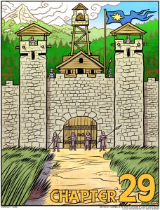
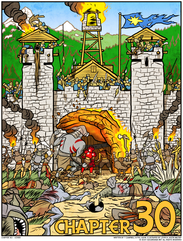
 So for this cover, we’re combining the exact same setting from Chapter 29 with the “everything’s falling apart under assault” mood of Chapter 18. It also reminds me a little of Watchmen, where the issue/chapter covers were just the first image of the story to follow; this is basically just a transitional frame between the last chapter’s ending and the siege thread we’ll pick up a few pages in, after the title drop.
We’re bending our usual injunction against showing full characters by including four Champions but not making them the central focus. Frigg and Rachel are nowhere to be seen now: they’re with the others, getting set to be the “last line of defense” once that door goes down.
Chapter 30 was more frustrating for us to write than it is, now, for me to read. I think we were growing aware that this would be the only big Peacemakers-Champions clash we’d get, so Phil felt a lot of pressure to make it just perfect, which meant yet more outline deviation and “do we really need this scene” conflicts. But looking back, there were a lot of characters here fighting for the spotlight, and I’m glad they pretty much all got their shot. The only part I do kind of wonder about… well, we’ll get into it tomorrow.


Those trolls with torches under the tower to the left are in for a nasty surprise when the oil hits them.
So why did you have an injunction against showing full characters on the cover?
Focusing on objects, backgrounds, more symbolic images tended to be more evocative while giving away fewer surprises, and a somewhat unified approach to the covers made the series itself feel like more of a unit.
I gotta take this moment to praise how all y’all (especially Mr. Waltrip) handled the depiction of this whole high fantasy military battle. Really stands out in terms of substance, detail, scale and depth.