Audition Annotation: John Waltrip
 Really, John had a home-field advantage.
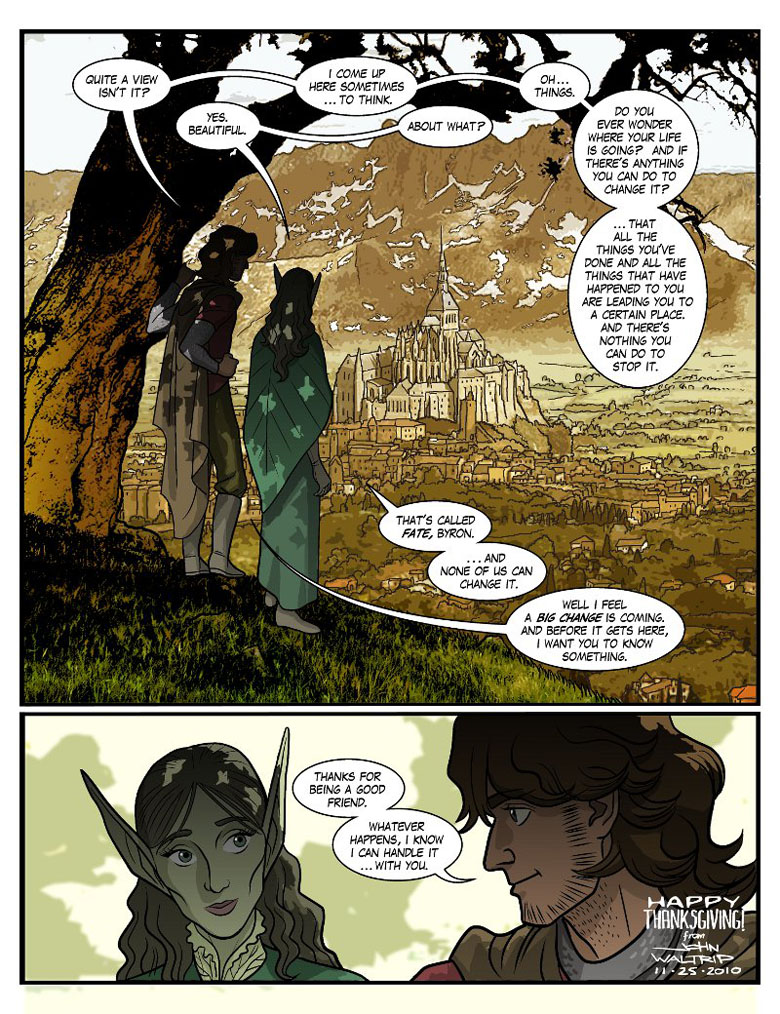
He’d worked with me before on Rip and Teri, and his brother, with whom he shared a house, had worked with me on both Fans and Penny and Aggie. So while he didn’t have any insider info about Guilded Age when composing this guest strip, he knew my sensibilities, which were close to Phil’s as far as tone was concerned. While the other guest strips’ goofiness was in keeping with the series we’d introduced, this somber, thoughtful page was more about where the series as a whole was going. Byron and Syr’Nj’s arc was a harbinger of our larger ambitions.
Obviously, it’s a first pass, and in the process of figuring them out, John rendered the two of them as he never would again. Even so, the amount of effort John was putting into making the characters’ model sheets his own (not to mention that background, whew) was enough by itself to get our attention. And I also knew he had the work-horse qualities needed to keep churning out pages until this thing was done. Home-field advantage, like I said.
We would hold a second round of auditions (which you’ll see in a little less than a week) to be sure, but this made John the front-runner. Tomorrow: Chapter 8 begins.


I remember when Jason took over an obscure Image title called Bohos, as well as his taking over from Giselle on Penny and Aggie and Dangerously Chloe, and how good he was at drawing to someone else’s style and gradually making it his own. And John did a great job here, too.
I find it interesting that the background shifts toward sepia. Unintentional foreshadowing?
That IS interesting, now that you mention it. Totally unintentional, and unknown! Had no idea about sepia world coming when I did this.
To this day, it bothers me to NO end the veritable shitstorm that formed in the comment sections when Waltrip started drawing for this comic shortly after this guest entry. I wasn’t even an active reader at the time of it happening, but reading all this stuff on that massive backlog of pages made me incredibly confused. And irate.
TBH, I expected a lot worse. Readers bond with an art style. You want them to!
Can’t say I could’ve expected it. I feel that initial style he was seemingly forced to shift from into what came after was absolutely fantastic. From expressions to details to the action, the whole presentation was my favorite point of this comic’s art. Not to downplay Erica’s art before it, I just really dug this one. I just get a bit sad remembering it was so short-lived.
I started reading a time after John took over so not quite sure what I would have thought as a reader at the time…I sort of understood it while going through the archives. As a long time reader of Fans, there are whole chapters of that comic I still haven’t finished reading simply because Jason didn’t draw them. So I do get being attached to an art style.
Johns art is so fucking good though, how could you not stick around for it?
Also, reading the comments on those first pages John drew make me understand why so few webcomics have comment sections.
I was remembering wrong, the comments for John starting weren’t so many bad. It was the big reveal coming up where people couldn’t handle things being different than what they’d planned to read!
Nice to see this again. Been a long time. I had seen that Guilded Age was accepting guest art pages, didn’t know that much about the strip then, read some of the back chapters and figured, “what the hey, I’ll send them a little Thanksgiving present. Probably never do another one again.”
little did i know.
John really did do a great job with this page.
I do remember seeing this one and liking it the most.
Definitely one of my favorite guest strips. At the very least art wise. I’m also a sucker for the quiet moments in shows and comics