Annotated 30-12
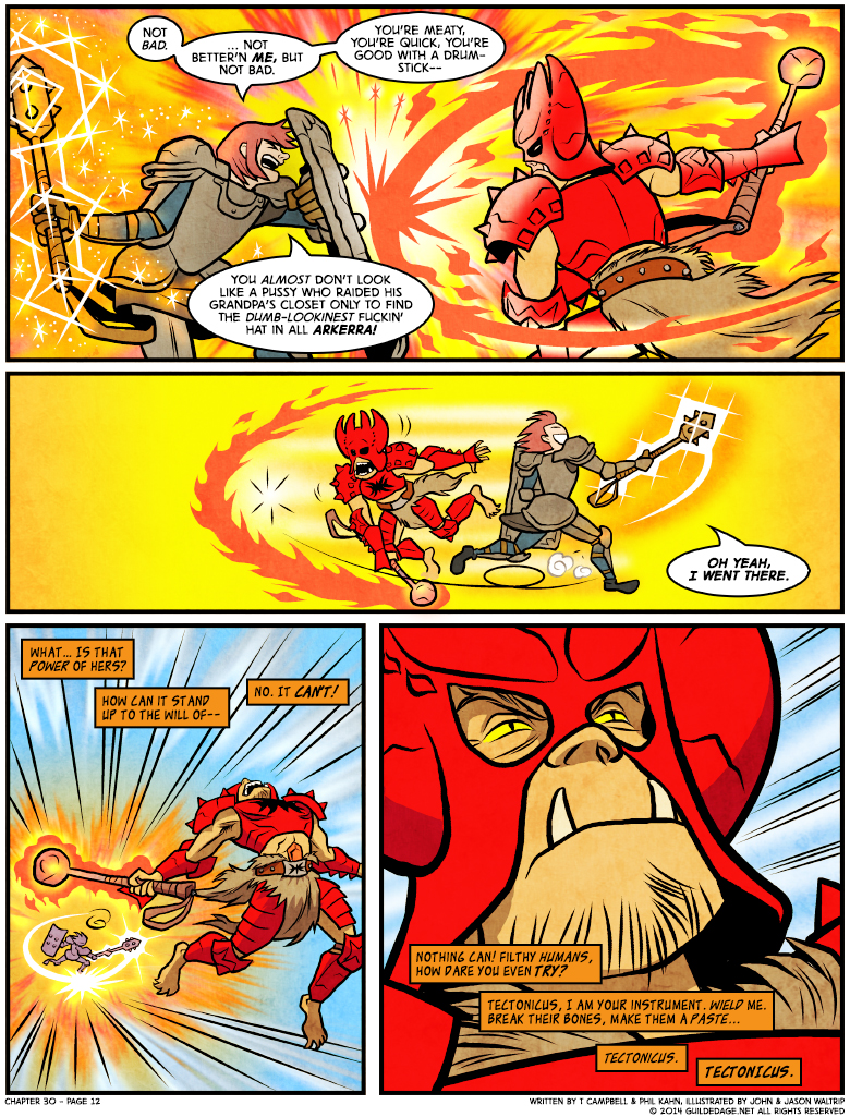
 From Phil’s dialogue here, I… gather he was having some second thoughts about Penk’s design. I mean, I don’t think the helmet is that bad, on its own!
It is true that something about it looks vaguely wrong, but that’s reflective of the difference between Penk’s true personality and the persona he’s trying to project: the troll who doubts versus the demigod who leads. Over time, they will become one, but that hasn’t happened yet, at least not as much as he wants to believe it has.
And there’s other ways in which his beliefs are colliding with reality. The good news, Penk: you live in a world where your god is provably real! The bad news: POLYTHEISM, BABY.


Well, once you’ve already gone up against Harky, who wouldn’t hesitate to kick your ass while wearing barely more than a loincloth … then I’d think going up against a troll wearing all that armor would be less intimidating, not more. And, well, that helmet is definitely the epitome of that armor.
I think the hat falls into a bad spot where it looks both too ornate for a battlefield, while also looking kinda shoddy. Like a big pointy headdress designed to funnel blows into your forehead.
I’m not sure she goes by Phil anymore, but you are definitely not using the right pronouns.
I am still going by Phil both publicly and legally, and I straight FORGOT to tell T about my pronouns so don’t worry about it ~ <3
You… You left for cigarettes 30 chapters ago…!!
; _ ;
The one constant between all MMORPGs is that virtually every hat or helmet available is either wildly impractical or just stupid looking. That’s why almost no characters wear them or else they hide them in the settings.
I have two issues with today’s comic:
1- I grew up enjoying comics about Jack Kirby’s many superhero (and supervillian) characters. Most of his character designs look cool to me, and even the few misses Kirby had along his career remind me of his many hits. I say that because Penk’s helmet remind me of Kirby’s style. Modern internet, however, seem very adverse to that kind of aesthetics. I still shudder when I find people actually defending Tim Story’s decision of not including Galactus in a Fantastic Four movie (no, a cosmic CGI swirlie doesn’t count). People actually b*tched when James Wan, the director of Aquaman’s movie, had the gall of actually making Ocean Master look like in the comics, helmet and all. Frigg’s little remark reminded me of that.
2- About Mr T Campbell’s annotation, I got to say that if a powerful force with a name -a force that actually responds when I use that name- makes tangible, objective, concrete changes on me and/or the world around me, then it definitely qualifies as real. We could debate if it is indeed a deity, but its existence as an actual thing would be a fact
About your second “issue”: I doubt anyone thinks otherwise, and certainly not T! (Note that he wrote provably real, not probably real.)
Right you are. I totally misunderstood Mr T Campbell. I stand corrected
I found Penk’s armor overdone from the start. But then I like to say it’s not what you wear, it’s how you wear it. At this point in the story, Penk certainly looks a bit like I did the first time I wore a suit and tie, and possibly feels that way, too. That changes over time, as well it should.
The helmet does look wildly impractical. I can’t imagine how its center of gravity would not be above Penk’s head, so keeping it from sliding off would be a pain, and that big eccentric mass attached to your neck, directing all vertical blows to your skull seems like an eminently bad idea. But then, I never complained about Byron’s shoulder blades, or why dear Frigg is not wearing a helmet with her plate, and dangit, this is a MMPORG so appearance probably counts as much as practicality. And in that regard, Penk’s helmet does precisely what it should, better than most other helmets could — including drawing Frigg’s mockery. That’s part of its function, as far as I’m concerned.
I always found penk’s armor, and especially helmet, a bit weird. Like, I feel that anyone taking one look at him couldn’t take him seriously. I don’t think it’s the design though, it’s more about the color. Bright red sticks out a lot.
Not to say it looks like crap though. The art is great as always. It just has a weird aesthetic. It’s very distracting. Any maybe that’s the point? As a bard, being distracting may be a class feature. As a leader, sticking out might be something he could intentionally want?
Actually, is Penk the first troll we’ve seen wearing this much armor?
Because I feel like he is.