

Annotated 21-10
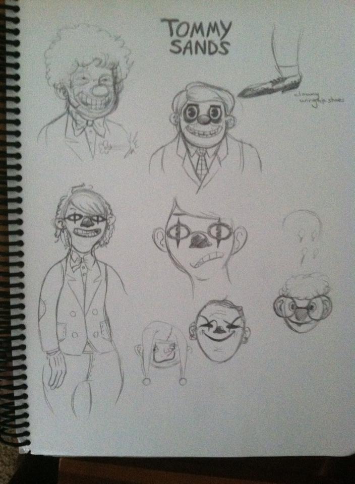 Storytelling by typography is something I wish I got to do more. There’s a project I’ve kicked around for over a decade called Tommy Sands, which would reimagine familiar typefaces as people. Unfortunately, my main idea for it was to turn Comic Sans, the world’s most widely (and not always justly) hated font, into Tommy Sands, a depressed and unappreciated clown whose brother was the ruthless, abusive executive Gil (alluding to the real-life Eric Gill, creator of Gill Sans, whose geometrically beautiful work should not outweigh his sexual atrocities, but pretty much does because only font nerds care about learning font creators’ personal lives). Art here is by Jeffrey Onwaluru, who worked on the version that came closest to fruition.
Sounds familiar, doesn’t it? Yeah, even though I drafted all my versions of this well before 2019, today it just looks like a gimmicky Joker knockoff. Janice suspects that I ultimately never committed to it because I just don’t have it in me to be that depressing, and the most upbeat ending I could visualize for it would still entail a lot of darkness.
ANYWAY. At least we could get John to do this page with handwritten signatures, each of which captures something of its signer’s character. A lot of comics, even professionally created ones, try to substitute “handwriting fonts” for diegetic handwriting, and I always hate it.
So to answer the question I raised earlier, I feel like E-Merl and Scipio are kind of go-with-the-flow types who may not think Bandit’s perfect, but they are comfortable enough under her command that given a neutral, campaigning-free vote like this, they’ll go with what they know.


It looks like Frigg was trying to write “Gravedust”, but just did a really shoddy job of it.
I didn’t see it until you said it.
“So to answer the question I raised earlier, I feel like E-Merl and Scipio are kind of go-with-the-flow types who may not think Bandit’s perfect, but they are comfortable enough under her command that given a neutral, campaigning-free vote like this, they’ll go with what they know.”
Interestingly to me, this implies that if Syr’nj had simply announced that Byron would be field leader from now on instead of holding a vote, the only ones likely to object would have been Bandit and Frigg.
But Frigg would probably have done so in a loud, crude fashion.
That bottom left Tommy Sands concept sketch has a nice kind of John Allison vibe to it
I’ve always felt like an absolute outcast when people start talking about font. I barely notice when I go program to program and the default font changes but everyone seems to love having a massive hate-boner for Comic Sans. When I first saw those irate discussions about how Comic Sans is worse than the people that crucified Christ, I thought it was a meme. Like arguing over butter-side up vs butter-side down, you know? But if it was a meme it evolved beyond anyone remembering it is.
…And here I am, seeing T. praise another font and I am all “what the fuck” again…
It’s a bit distressing, it’s like not being able to see something everyone is telling you is right in front of you. Like suddenly going blind. lol
On a different topic: Absolutely love the style on the guy that made those clowns.
Unless you’re interested in typography, a good font usually shouldn’t be noticed, especially not if it’s body text.
The hate for Comic Sans goes back to the nineties. Back then, the web was saturated with personal web pages made by people who, very extremely obviously, weren’t graphic designers. Things like centered text with wildly different line lengths, interesting color choices (red text on blue background… *shudder*), blinking lights and spinning mailboxes, and not much actual content, because the web was young; simply just having a personal webpage was all kinds of cool (unless you thought computers were for dorks).
Comic Sans was one of the few fonts that came included with Windows 95, and the only one that looked kind of “fun” or informal. Because of that, it was used on lots of personal web pages. And while the other standard Windows fonts were used just as badly by hobbyist web “designers”, they were also used well by professional web designers. Comic Sans was entirely in the domain of amateurs.
In short, much of the hate for Comic Sans is guilt by association. With the meager selection of fonts available to most of us, Comic Sans stood out, and it was often accompanied by horrible graphic design.
That’s not to say it’s without flaws, but with all the free fonts available to web designers today, there are bound to be many that are far worse. They just don’t get noticed.
I was aware of a smattering of this information and this helps complete the picture. So it feels like people hate on Comic Sans because it STILL stands out – that is, it’s easy to recognize. Maybe that’s due to the hatred of it, causing typeface designers to avoid anything that looks too much like it. If that’s true, then it falls into an odd space of there being a situation where it’s a legitimately good – or even the best – choice and it’s summarily ignored by reputation.
I don’t think Toby Fox’s Undertale has had any effect on the reputation of Comic Sans, despite his Sans being the most/second-most popular character.
So, it’s a tie between Bandit and Byron… What next? Arm wrestling? A duel to the death? Darts?
Look at the way she holds that pencil…
Have we ever seen Frigg write anywhere else? Does she even really know how? Or did she drop out after first-grade?